"Haunted"
This lesson was a lot of fun, and has so much potential for adding drama, depth and/or cheer to many pics that could use a little more ...

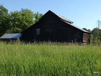
This is the image I started with. I know -- bad lighting taken at a bad time of day. I drive past this shed on my way to work meetings in another city. It's about an hour away from where I live, and I tend not to go there unless I'm there for work. Now that I know how to get to the frontage road, I may stop more often to get better pictures of it in future ... The technique I used to transform this image is not what Kim demonstrated in this week's lesson. However, with the cumulative knowledge I've gained from Kim's classes, I turned this awful background image into something much better!
On the farm where I grew up, we had several buildings with this kind of blackened, weathered wood. For some people, this might look really spooky and ominous. For me, it's a comfort. These buildings survived many a storm over the years. I saw this kind of wood every day on the farm. Most of them are gone now ... In the old machine shed, my brother and I used to play upstairs in the granary. That's where Great Gramma Smitmajer's old treadle Singer sewing machine ended up. We loved seeing the machine rise up out of the case, and making the treadle run.
Here is the processing layer-by-layer of "Haunted":
Layer 1) Background Layer - Extend canvas with crop tool. I knew I wanted more room for the stormy sky.
Layer 2) Copy Background Layer. Pulled it into RadLab in attempt to rehab some of the lighting problems. I really wanted to lighten up and focus on the old weathered wood of the shed. I didn't care if the rest of it was blown out. That could be recovered with texture later ... In RadLab, I applied 2 rounds of Old Skool (minus the Vignette) and 1 round of Milk & Cookies Black and White.
Layer 3) Back in PSE : Copy RadLab Layer - Screen Blend Mode
Layer 4) Add Storm Clouds by Smoko - Multiply Blend Mode - 61%
Layer 5) Copy Layer 4 - Soft Light - 100%
To show that I really did do the work for this lesson, here's my version of the practice pic Kim offered of a canola field. We learned how to use the Quick Select Tool to isolate either the field or the sky, and use a layer mask to replace the existing sky. This is such a slick technique! I know I'll be using this a lot in future. The Sky I chose is one from Nite-Fate's Free Stormy Skies Stock. Just a chunk of a much bigger sky ... I also used the brush to blend a place on the right where the canola flowers met the sky.
Kim's practice pic of a canola field with flat sky.


1 comment:
I envy the great things you are learning. I can't figure out how to 'smooth' or 'blend' those skies or other backgrounds brought in to enhance a photo. Mine have always ended up looking like I brought in a new background or sky! Oh well, it's a pleasure to see it done so well. Great work!
Post a Comment