This blog records my experiments and successes with fabric and fibers, surface design, stitching, weaving, photography and whatever else strikes my fancy. Enjoy ...
I love the textures in this picture. Over the weekend, I took a walk in my dad's woods. There's an old rubbish heap. This is an old metal screen being reclaimed by the elements. Moss is breaking down the wooden frame.
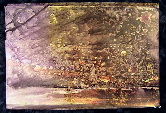
I think this might have been a piece of old carpet left out in the woods. I don't think it's wool, or anything organic, but I like how it's aging in the woods. We don't have many sheep around these parts ...
And this chunk of wood is breaking down into little blocks, kind of like when the wood burns and falls into burning embers. It holds this shape for a while.
Back in January, I was intrigued with with the Macro in a Mason Jar challenge. It's taken me a while to come up with something so simple as stacked pineapple rings framed by the tablecloth.
On Sunday, I was in a day-long class sponsored by Darting Needles Quilt Guild in Appleton. With Aniko Feher's help and guidance, I got this far on "Nadiia."
I still need to choose fabric for her hair, and a background, stich it all down, and quilt and finish it. I really like the eyes. Aniko showed us how to use water-color pencils to add highlights. Much easier than trying to do that with thread or applique.
On Monday, she taught a second day-long workshop on how to make your own patterns from photographs. Of course, now I wish I would have signed up for that one, too. I could have gotten a good start on a Maggie Portrait!
Aniko also sells coordinated fabric packs for portraits which helps take the guesswork out of the process. Now I'm interested again in dying skin tone gradations ...
I added this pretty French ribbon to the hood of my in-between coat (not a winter coat/not a summer jacket).
I bought the ribbon in Toulouse, France, 7 or 8 years ago. There's an amazing little shop there where you can buy gorgeous ribbons and buttons--La Droguerie (The Drug Store). It's an odd name considering that's not at all what they sell.
My friend, Francine accompanied me, bless her heart. I still don't speak French (though I am understanding more), so she brokered the transaction for me. All I had to do was point to all the pretty things I was willing to buy that day. Even now when we go back to visit, Francine asks me if I want to go to back to La Droguerie.
It was on this very street in Toulouse, that I swear I saw David Bowie stopped on a bicycle watching pigeons and smoking a cigarette. He's more petite in real life than I had ever imagined. It's too bad Google didn't get a picture of him there! Well, even if it wasn't David Bowie, it's a nice memory in my mind of Toulouse.
I got this ribbon at the same time.
This one is on my winter coat. I got this one done years ago!
The version at the top of this post uses one of the National Geographic Citrasolv backgrounds in a collage. The marsh grasses are cut from a different piece of NG-CS paper.
This design is simple enough that it could develop into a journal quilt. Didn't someone say something about working in series? We'll see what develops ...
The initial layout for Unca Ray's Barn Red Quilt. Some of those reds look a little pink on my computer screen. I assure you, they are not pink on the real thing!
Band Together by Weeks Ringle and her husband Bill Kerr of Fun Quilts. The pattern was published in American Patchwork & Quilting in February 2010. This project turns out to be an excellent lesson in how far you can go with just 2 colors. Red is red, right? There are A LOT of reds out there in the world. And they all seem to go together!
Red-Wing Blackbird Made with Neocolor II water-soluble crayons
This is the line drawing I started with. I usually do these on a loose piece of paper. When I get it to where I like it, I trace it in pencil, flip it over and burnish the image into my sketchbook. That's why the final piece is in reverse. I've also been gluing the outline drawings into the sketchook near the final piece. That way I have a record of how the piece developed.
This one is BEFORE adding the water to blend the colors. It's amazing how a little water adds such vibrancy!
History : We have another red-wing blackbird pair nesting in a tree in our back yard. That means, I'll have to watch my head in the back yard : If we get too close to their tree, they dive-bomb us. Good thing that only lasts for the nesting season!
You can click on the slideshow to see larger images. These all came from the April 2008 issue of National Geographic, in case you are interested in getting similar results. ;-)
I am so impressed with the results from this technique. I LOVE-LOVE-LOVE the results!
I'm not quite sure how I'm going to use these yet ... Collage? Not sure I want to invest in a new printer with the dye inks. 1 page would use up a lot of ink with this kind of saturated color. I wonder how a monoprint direct to fabric might work? It also makes me wish I knew more about PhotoShop and Layers. I've already got some ideas ...
As a follow-up on the process, this is a picture of a hole the Citra Solv and ink ate into the pink foam board to which I had pinned the pages to dry. It also allowed the wet ink to run interesting streaks. Next time, I'll cover the foam with a blotting paper (or something).
A few months ago, I was opening the mail and this strip of paper peeled off one of the envelopes. It landed as this lovely little curl. Instead of just tossing it into the recycling, I took it upstairs to photograph it. Nice, huh?
I had every intention of actually putting pen/pencil to paper and sketching them out, but time got away from me. I did this outline drawing :
I also played with the images in Paint.net. Here are the results :
This is what's up on my design wall at the moment. It's the "draft" version of my next journal quilt. No--it's not technically in my sketchbook, but a design wall can serve a similar (and different) purpose on the road to actualization.
I had started this months ago, even fused some flowers down, but it just didn't work. I guess I was waiting for this perfect prompt from Jane Davies! Already, I like it much better--even with this mixed media version. The branch is an ad torn from a newspaper.
This journal Quilt came before the sketch below. I was thinking about the magnificent "fire fall" at Horsetail Falls in Yosemite National Park. It's not lava, but a trick of the light. The water fall is seasonal, only when the snow melts, usually in February. If you can be there at just the right time while the sun sets, you can see an amazing light show :
The Fire Falls
After watching the PBS documentary on The National Parks, I was also remembering how the park officials used to stage a fire fall for tourists. They built a gi-normous bonfire, then pushed it over the cliff. It looked spectacular, but I have to say, I'm glad they don't do that anymore.
"Thousands of people from around the globe would line the meadows and
roads every evening to watch the spectacular event of fire falling more than
3,000 feet from Glacier Point to the valley floor. In fact, many came to
Yosemite just to experience the "Fire Falls." From 1872 to 1969, for almost
one hundred years, every summer, at exactly 9 p.m. a man would stand at
Camp Curry below and shout to the man at Glacier Point above "Let The
Fire Fall." At that instant, the man tending the Fire at Glacier Point would
shout his answer down, "The Fire Is Falling," and they would
immediately begin pushing the burning coals and fire over the cliff. It was a
spectacular display of falling, descending fire! Over 3,000 feet of brilliant,
flowing, glowing fire cascading down the sheer wall of Glacier Point."
A Spiritual Experience
In a recent TV documentary interview one of the 'old timers,' that called the fire down, emotionally said, "we always thought it was like a spiritual thing, like a church experience." With his voice breaking, he said “people were deeply touched. Each night when the event ended there would be deep silence, or almost reverence.” He said “people would be weeping everywhere. Then, after a minute or so, hesitantly, someone would break the silence with a weak applause. The applause would then escalate into a roar.” It was an awesome event, a momentous occasion. Everyone was blessed, the rich and famous as well as the more common folks. All races and colors of people from all over the world were somehow deeply touched by the Fire Falls. The old timer said “it riveted the people together.”
Enjoy these pictures!
Detail The Making of Fire Fall I started with the blue background fabric--a piece I dyed in 2009. One of my self-imposed requirements for these journal quilts is to use some of my own hand dyes. I thought this blue worked well for the sky ...
After choosing the base fabric, I started in on the cliffs. I'd been thinking about a mono-color collage, so I pulled out my bag of black scraps and started laying them out. Then I decided it needed more dimension to make the rock faces, so I pulled out the yarns and started building a composed fabric. My friend Lois (by way of Lynda) gave me a skein of silk from China. It has strands of copper in it. It doesn't show up well in the picture, but that little bit of sparkle adds to the piece. Once I had the cliffs "built," I covered it all with black tulle, and stitched it down to hold all those bits in place. The orange is the last bit of a striking Halloween fabric. The orange wave seemed appropriate for this piece.
The binding is a basic envelope treatment, turned right side out. I did that before the quilting--because it would not have worked afterwards. Turns out that quilting the sky pulled and shrunk things enough to pull it out of square. On a small piece like this, I don't think it's a problem.
For the quilting, I decided to use on of the Beyond Meandering designs I learned in the Chris Lynn Kirsch class at the Sewing Expo. The wave in the sky seemed like air currents. That's a fun filler pattern to stitch out.
Finally, I added the beads to the fire.
The sketchbook sketch came after the journal quilt. I wanted to document the process, so I glued the inspiration picture int my journal. Then I decided to draw a rough sketch in pencil. Then I colored it in with Neocolor 2 water-soluble crayons. Above you can see the BEFORE water version. Below is the AFTER water version to soften and blend the colors. I LOVE these crayons!
This rough sketch took all of 15 minutes start to finish. I remember how I would agonize over drawing anything back in January. How things that should be quick took 3 hours. Maybe that's the difference between doing it to start, or at the end. By now, I know the subject and drawing it is easier.