Monday, July 29, 2013

2BD24 Capturing Emotion


This week, Kim asked us to capture emotion ...  I was glad of the prompt to capture portraits, as flowers and still-lifes can't/don't show emotion.  This is a picture of my mom, just about to burst out laughing.   See that sparkle in her eyes?  ;-)

While Kim's Dramatic B&W recipe didn't quite work for this one, I did play with levels to clarify her skin.  I know she'll be surprised to see herself here (Hi Ma!). 

Capturing emotion is a tricky one--To see someone sad, and to take their picture seems like such an invasion of that private, candid moment, yet I love the portraits that allow me to see that ...


Here's another one of my son, Oliver and his "little brother," Aidin.  They are not really brothers, but they've known each other their whole lives and treat each other just like brothers.  Oliver hates having his picture taken, hence, he's hiding his face in a cringe.  Aidin is a whole other story ...  as you can tell in these 2 shots.   Every summer, Oshkosh hosts Sawdust Days as a celebration of our logging history.  Carnival rides and carnival lights and carnival food.  This was a lot of fun for the boys on the verge of adolescence.    The background is a Lost & Taken Summer Texture.

Beyond Layers

Sunday, July 28, 2013

2BD22 Focus and Blur

 
I bought a new camera this summer : a Canon Rebel T3i with some fancy lenses.  This is one of the first pictures I took with the 50 mm 1:1.4 lens.   I was pretty impressed.  No messing around with aperture settings.  The lens takes care of it. 

Here's another one for this week's lesson, taken with the 40 mm pancake lens.  Every summer, we have a Buck Skinner's Rendezvous in Oshkosh, along the shores of Menomenee Park.  People come to re-enact life and times in a 1700's buckskinners camp.  As you can guess, there are merchants galore selling things like beads, furs, leather goods, feathers, tea, iron work ...  It's a fun time.  That blur in the background left is the shop owner, wondering why I'd want to take a picture of a basket of feathers ...  He was a good guy.  My kid bought several items from him, including a flint fire-starting kit and a mini-cross bow.  He certainly knew his clientele!

Beyond Layers

Friday, July 19, 2013

2BD20 : 1 Photo 3 Ways


The Lesson this week was to take 1 photo and work it up 3 different ways. 

PSE Version 1


AutoPainter iPad App - Benson Treatment

PhotoStudioHD iPad App - Charcoal Sketch


Original Photo from The Apple Sessions


 Although I really like this picture from the Apple Sessions a few weeks ago, it has some challenges.  The background is so dark, it's difficult to add textures, so I did the basic PSE treatment of adding text and a heart brush.   I thought this would be a good time to play with some of the many iPad photo apps I've collected in recent months.   First, I  did some basic edits in SnapSeed (Added Drama1 and a Black-and-White Neutral treatment) before pulling it into AutoPainter and PhotoStudioHD respectively.  It's kind of fun to see the transformations.   And gratifying to see the effects of paint and drawing without having to actually invest in expensive art supplies and actually learn the techniques.  ;-)


Kim Klassen's Spring Blossom Pic with Romantic Recipe 1 in LightRoom 5

Kim Klassen's Spring Blossom Pic with Hazy Sun Recipe 2 in LightRoom5
Kim Klassen's Spring Blossom Pic with Recipe 3 Edits in PSE
Original Spring Blossoms Photo Sample Pic by Kim Klassen


I actually started the lesson with Kim's sample pics and the recipes.  This lesson did not go well for me.  Lots of frustrations with LightRoom.  Sigh!  This is a new program for me.  For years, I've been using Picassa to manage and organize my digital photo collections.  It's been working out just fine, but with all the talk about how wonderful LR is, I decided to make the switch.  I've been using the beta version of LR5 for a few months, and finally purchased a copy in June when it was officially released.  Thought I'd better sign up for Kim's Round Trip class so I'd actually learn to use it, practically speaking.  I'm through the first week (1 of 8) of lessons with 17 pages of notes and at least 10 hours of time invested so far.  She packs it full of information!  That was just week one ---  There are things I know how to do in my sleep in Picassa.  I don't even have to think about it.  Not so in LR.  I should be easier on myself--it's a brand new program for me, with another Adobe (not-the-most-intuitive) learning curve.  PSE was difficult in the beginning, too.

So I figured out how to make a virtual copy of Kim's sample spring blossom image, and worked through her 2 recipes.  1 thing that threw me for a loop was the White Balance Preset.  Kim likes to use a "cloudy" white balance preset.  The only options I saw in the LightRoom Basic Panel were "As Shot, Auto, and Custom," so I'm not all all sure if that's just a variation between LR4 and LR5 or if I'm really missing something?   I don't know enough about LR or all those settings to make my own Cloudy Preset.

Also having trouble with those Tone Curves.  I can't figure out how to grab onto the endpoint and move them up or down the graph.  Whatever I select just moves the curve, but the end points remain corner to corner.  ???  Anyone know the trick to adjusting those?

So I had my version 2 and 3 done.  LR decided to "stack" them.  I guess that means LR recognized they were all related and made a mini-collection on the fly. 

The virtual Copies were in a stack : Kim's original sample pic, along with the 2 Light Room tweaked versions.  At some point, I wanted to make another copy so I could try Recipe 3 in PhotoShop Elements.  That seemed to work -- The Elements Recipe was so straightforward and simple, it only took about 2 minutes!  Then I went back to LR to look at all 4 versions and compare.  And the first 2 LR versions were nowhere to be found!  Ugh!

I'm still not at all used to the organization system.  In Picassa / PSE, I like to name the files and add captions so I can easily tell what assignment and what version.  I guess I can do that with keywords in LR, but that seemed to get lost -- Kind of a pain to flip to the keyword window just to see which was which.  Then it looked like I had 2 extra plain copies of Kim's original sample pics sitting there, so I deleted them.  Turns out, I must have deleted the whole stack.   Grrrr ---  I hope Kim has a lesson on this Stacks Phenomenon.    Breathe!   You can do it all again ...  It will stick this time, right? 

So by the time I re-did everything, I decided to make my copies of Kim's original in Picassa then make the LR edits.  I thought that method would be clearer in my head.  And it was --  but now I have multiple images with multiple edits in 2 different catalogs.  Picassa can't see the LR edits, so some of those pics look like plain old copies of the originals.  Are you confused yet?

Beyond Layers

Sunday, July 07, 2013

2BD19 Finding My Style : Rust and Grunge


For this week's lesson, Kim asked us to post a photo (or two) that captures our own unique photographic style.  It's pretty clear that my own style is very different from the light, airy, dreamy flower pics that Kim takes--or most of my fellow 2B classmates, for that matter.  That's not a criticism--just a simple recognition that we're different.  I prefer vibrant, saturated colors, grunge and texture.  Rural decay, as opposed to urban decay.  I think my favorite Blend mode is Multiply.  Don't get me wrong : I like the flower pics, too--I just don't think I'd call it MY style.  Differentiation is GOOD!  That makes the world infinitely more interesting!

I grew up on an old farm in the country of northern Wisconsin.  We had old farm machinery like this on the property--mostly laying out in the woods to rust in perpetuity.  Junk--not even Junque back then.  Although I can't say I appreciated these rusting hulks as a kid, they were always there and they became familiar to me all those years.  Now, I love not only the rust, but the elegance of the design of these old machines.  Once in a while, my Dad would pull one out, oil it up, attach the power take-off and put it back to work.  All those moving parts working for a united purpose ...  The marvel of engineering!  (I have to say I have a NEW appreciation for the safety features of modern-day equipment, too, as that was not a consideration in the old days.  Plenty of farming accidents attest to that--my own family included.   My great Grappa Albert Smitmajer lost a hand in a power take-off back in the day ...  Eeesh!)

Here's the original photo, made black-and white.  I found this beauty at the edge of the field used for a parking lot at the Door County Ren Faire a few weeks ago.  If you look closely, you can see modern-day cars parked in the field in the background.  A nice contrast of old and new.

Photo Processing Layer-by-Layer :
1) Background image
2) Gradient Map - Black > White
3) RadLab : BAMF BW - Old Skool - Meadowlark - AntiqueTone - Technicolor Dream World
4) Nancy Clayes Texture Arapaho - Soft Light 100%
5) Text - Palatino and Buttercream
6) Color Fill Frame - Black - Soft Light 71%

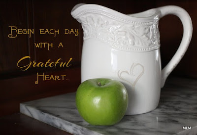
The quote comes from a young woman named Etta Turner (fascinating and sad story).  I volunteer for the order of nuns who founded my Hospital.  This quote was on the wall in their craft room yesterday.  I thought it was very fitting for this 2B lesson about finding your own style.  (The older retired nuns in their 90s often still wear a modified habit.  That uniform makes them more-or-less the same as all the other Sisters.  Back in the day, conformity was key in the religious community.  No one was supposed to stand out.  That is -- until you actually get to know them, and you realize how different each Sister really is.  They all have their own personalities--as you would expect!)

Here's another photo that says Michele at Sweet Leaf.   It's a photo from our wood pile in the driveway.  I took it last year for The Beyond Layers lesson about Shapes in our natural surroundings.  Yes, we heat our house with wood in the winter months.   The wood has so much rich texture in the wood grain, end cuts, bark and lichens.  That contrasted with the metal wash basin.  We use this to cover the engine of the wood splitter, to keep rain water out of the gas tank.  This photo is pretty much straight out-of-the-camera.  Not a lot of neutral space to add layers of texture or words.


Last fall, I did a photo project with Vasalisa and her Flaming Skull Torch, based on on old and favorite folk tale about Baba Yaga.  This was a lot of fun to do, and took a lot of planning to scout out the scene, plan the day, coordinate with the model, get the costumes and props ...  I would love to do more like this --  illustrating stories and faery tales.  It's such a deep and recognizable well to draw from ...   I would love for this to become my signature style.  ;-)

Beyond Layers

Friday, July 05, 2013

2BD18 Old Shed in SnapSeed


The Beyond Beyond lesson this week involved a bit on iPhonography, using Snapseed to do some basic photo editing.   I have SnapSeed on my iPad, so I used one of the old shed pictures for this play date.  I wasn't keeping notes, so I can't tell you exactlywhat I did, but it involved SnapSeed's Tuning, Drama, and Black & White options.  Kim also mentioned PicTapGo, which is the iPhone app for RadLab.  Unfortunately, there is no iPad version, but if you have an iPhone it's an incredible deal at $1.99. 


With a little more tinkering, I figured out how to add a Sepia tint to give it a different old-timey feel.   I also added one of the given textures to add some interest to the blown out sky.    When I edited this image in PSE, I was able to extend the canvas to make a bigger sky for the storm clouds.  This altered the composition so that the shed was not sitting smack-dab in the middle of the picture.   With iPhoneography, I see I have to be more conscious of composing shots as I take them ...  In this case, more sky, less grass in the foreground, shed off center.  Not bad for a first try, though!  I can see how this could get addicting ...

I have several Photography Apps on my iPad, but I haven't taken the time to really sit down and play with them.  Usually, my camera and my MacBook are not far away.  I have processes that work for what I do, and since I don't have an iPhone that's always with me, I haven't made that transition. 

Lots of frustrations with the Photo Transfer App this am.  It shouldn't take 45 minutes to transfer 2 images.  In the end, I abandoned PTA and went for Drop Box which seemed to work a lot better today.   I understand that SnapSeed works very well for/with Instagram.   Since I don't have an Instagram account (a conscious choice for my lifestyle at present), I wanted to send the image back to my MacBook so I could post it here on Sweet Leaf.  I know--I know : Why not just compose the the post on the iPad?  Because I have a system that works; The photo archive for 2B is on the MacBook. 

Now on to understanding and using LightRoom better ...

Cheers!

Beyond Layers

Thursday, July 04, 2013

June Photo-Heart Connection : A Joyful Gif

[Sorry to be repeating this for those who've already seen it, but I felt the need to break this out into it's own post for the Photo-Heart Connection offering for June.  This little animation just plain makes me happy.  ;-)  ] 

The other part of Kim's 2B (Beyond Beyond) lesson for the week was to create an animated gif.  I've been thinking about this one for a few months now ...  We live in Wisconsin, with snowy winters.  We heat our house with wood.  The beds are piled high with quilts to keep us warm after the fire goes out for the night.  One of the Joys of Winter is to snuggle down into a drift of blankets.  Cozy and warm.  Even better to be "made" into the bed.  My husband is such a Sweetie about this.  He gets a kick out of the fact that I am so easily amused.  It makes me feel like a kid again--like playing with parachutes in gym class.  Remember that?  The silk drifting down ...

Here's a sketch from my photo-ideas journal.  He looks like a beardie-weirdie, but don't let that scare you.  He's a sweetie! You can tell by the smile on his face.

The quilt is one I made for my grandfather.  It came back to me after his death.  For him, I called it The Orange Blossom Breeze Quilt.  But since I fell in love with ABC's Once Upon a Time, I've been calling it The Enchanted Forest.  I LOVE this quilt.   

As for the photography, I figured out how to set the camera to take continuous shots with 1 press of the button.  So I laid on the bed, with the camera focused on CL's face.  He smiled and joyfully tossed the quilt again and again.   I wound up with about 300 pictures to sift through.  Whew!  What a job to distill it down to just 8 for the animation.  This was a lot of fun!  I highly recommend it.  ;-)

My Very Supportive and Wonderful Sweetie.

2BD17 : Eyes-on-the-Prize Do-Over


For this week's lesson, Kim asked us to critique our own work.  Work worked well?  What could be better?  Consider what we'd have done different and give ourselves a chance at a do-over.  I took the Maggie-apple pic from the last post.  After sleeping on it, I thought I could improve it ...

As a reminder, here it is from The Apple Sessions.  I decided the green was just too overpowering, so I used The Coffee Shop Blog's Selective Color Action to black-and-white-ify the image, and used a layer mask to brush back in selective color on the apple and Maggie's face.  True, she is a black dog, but returning the color to her eye and tongue really helped bring it back to life.  Not to mention the many shades of black in her beautiful coat!    I also cropped it down to be more square.

Yes!  I'm much happier with this do-over.  I think this one is worth framing and printing!  Thanks to Kim for suggesting the do-over and giving us the chance to revisit one of our pics.

 Here's the Evil Queen Do-Over.  Again, I used the Selective Color Action (as above) to tone down the too-green background.  But she came out looking more like a cartoon character (Well--I know she is Disney, but that's not quite the effect I was going for here.)  I added a few textures, and a gradient to brighten her face and tone down the purple in her gown.    Yes--another tweaking success!

This is where I left it the other day.  I'm liking the new one better!

Beyond Layers

Tuesday, July 02, 2013

2B D16 : An Apple a Day

Green Apple with Pitcher
The lesson this week was to take lots of apple pictures.  Practice makes perfect. She also encouraged us to step outside of our comfort zones and push our limits.
I did play with a version of this in PSE, but decided I liked the original SOOC best.

Red Apple with Pitcher
 
I must have taken 200 shots of this kind of macro on 4 different cameras with various settings and lenses in the past month.  Talk about practice!  Talk about pushing my limits (3 lenses to swap out).  I learned a lot, and deleted most of those shots.  
These are a few of the better ones.

Green Apple at Home
I really like this one - soft and golden.

The only tweaking for this one was to make it black-and-white.
Which one do you like better?


Eyes on the Prize
Maggie, my 2nd-hand Newfie loves apples.  Normally, she's very shy when I take out the camera, but she'll do just about anything for an apple.


                            The Evil Queen with Poisoned Apple

We went to the Door County Renaissance Faire this past weekend.  It's a relatively new and well-done Ren Faire that is growing.  Most of it happens in the woods, except for the jousting and Equestrian Arts which is in a field.  The Evil Queen was at the Wishing Well selling bottled water.  She took money, but also accepted apples.  ;-)  I could not pass up the chance to get her portrait with said apple.  What fun!
Here's the processing step-by-step :
1) Background image
2) Copy background image - Screen blend mode - 20%
3) RadLab : Contrast (Luma) - Sugar Rush - POS Lens - EZ Burn (Original) - Prettyizer
4) Kim Klassen's 1402 Magic Texture - Screen Blend Mode 47%
5) Kim Klassen's Printed Texture - Soft Light - 22%
6) Color FIll Frame (Black) - Color Blend Mode


Beyond Layers