
Coffee Stain on Blue
Beautiful grunge.
I just started a new online class by Denise Love at 2 Lil Owls. It's called the Art of Texture-Making Workshop.
I just finished the first watercolor lesson and I am blown away! So much content to her classes -- so much practical info along with the video demonstrations of the various techniques. Worth every penny! In the images below, I'm listing the technique so I can keep it straight in my own mind, but I am consciously NOT explaining each technique here as that would steal the thunder from Denise's class. Sign up for the class if you want to know more. ;-)
Here's a sampling of what we learned so far :

Tap Technique in Gold

Tap and Drag Technique in Blue

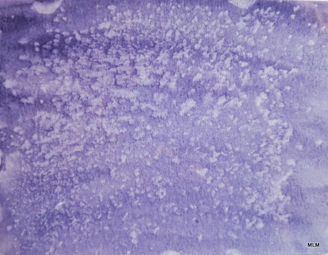
Spatter Technique
Salt Resist

Blotted with a Paper Towel

Blotted with Paper Towel

Blotted with crumpled Saran Wrap

Impressionist Sponge Painting

Blotted with Sponge

(Dry) Tea Stain
These are two of Denise's texture sets that used the techniques taught in Lesson 1 :
Speckled Garden by 2 Lil Owls (Denise Love)
Watercolor Impressions by 2 Lil Owls (Denise Love)
If you'd like to join the class, sign-up info is here : Art of Making Textures Online Workshop.
*************************************************************
A few more tips for my readers and classmates ...

1) I tend to keep a few extra watercolor cards as "sop cloths." This one was made entirely by picking up the excess paint on my work surface. I simply press the card face down in the color, and pull it off -- kind of like pulling from a glass or a gelli plate. This one came out very similar to spatter painting, in this case--probably because I used the spray bottle on my work surface. I just keep these going until I have something I like. I do stay aware of what colors will make mud, so I may decide to keep a "warm" and "cool" set going.


Over time, the journal fills up with nice backgrounds that I can use for warm-up pieces-- or even textures if I bother to photograph them. I learned this from a mixed media artist named Dina Wakely.


5) I worked out this nifty technique for photographing the texture cards. The watercolor paper tends to curl a bit after color has been applied and dried. To alleviate this, I use a pane of glass to hold the texture card flat for photographing. Works great! Although I have a scanner at home now, it's easier for me to simply photograph the textures and work with them this way. Maybe I'll learn something new in that regard, too.
On to the next lesson ....
1 comment:
At first I thought you were playing with textures in your computer program, only later realizing you were actually painting! Many of these techniques are familiar to me through the art journaling exercises I've been doing, except that I am working in acrylic paint for the most part. But this newer book also has me dabbling with watercolors and I feel a fish totally out of the water, no pun intended. ;-) So I follow what you are doing with great interest.
I watch a lot of video tutorials on Joggles.com and she often mentions preparing a bunch of pages in a book in advance, or that she sops up excess from stamps or stencils on another piece of paper for later use, but so far I haven't done much of that. Part may be due to limited work space and my nature of working in sequence or saving the "good" books. Part may be because I got in the habit of expending brushes on fabric since my previous paint experience has been on cloth not paper. A look at your book is giving me ideas - I really like its look on the outside and something like that might be more approachable for me.
Post a Comment