Showing posts with label Photoshop Elements. Show all posts

Thursday, April 11, 2019

Still Life with Garlic

Still Life with Garlic (V2)
Oil Glaze


Here is the original photo, looking down into our garlic bowl.
Lots of detail that makes it look harsh.
The bowl is pottery from west Africa with a black finish / glaze to it.  
It makes for a wonderful background in this image.

I was looking for a softer artistic impression, and I got it with Topaz above.

Just relaxing on a Sunday morning. ;-)

Tuesday, April 09, 2019

How about a Little Cow?

Charolet Cow in France

And now for something completely different.  I haven't done much with PhotoShop Elements lately, but this morning I thought I'd play a little -- just to see if I still knew how to do it.

Here's the original photo that I took in France several years ago.  These Charolet cows are from the Roanne area where Christian's Gramma lived.  Just like French wines tie back to the land where they came from, so does the cheese and beef.  Terroir - Taste of the Land.
 

Very Simple Photo Processing
1) Original Photo with basic touch-ups 
2) Pull it into Topaz Impression and try out the artsy filters
I settled on Cezanne I
3) Back to Elements
4) Crop out the2nd cow

Saturday, April 02, 2016

Sirena Blue - Variations on a Theme


Playing with PhotoShop Elements 14 and Topaz this afternoon.

Wow!  I love the way this turned out!
The original image, with Topaz Impression Georgia O'Keefe 2 filter.
Then cropped for the close-up.

 Here's the larger image, with the Georgia O'Keefe 2 filter from Topaz.


Here's another version.  This one uses Topaz Impression's Warm Haze 2 Filter.
Also nice in it's own way.


Here's the original photo, taken at The Bristol Renaissance Faire in Kenosha, WI. 

The performer is one of the talented ladies from Sirena.   If you don't know this group, check them out -- You may be as mesmerized as I was.  And that is what these Sirens do best!

Thursday, December 31, 2015

From Gramma's Kitchen : Egg Beater

From Gramma's Kitchen - Made with Love : Vintage Egg Beater

Gramma Matucheski used to make home made eggnog for me and my brother all year long.  
She would mix up eggs, milk, sugar, and vanilla and we had a tasty, foamy snack to drink. 
Now, my mom (a Public Health Director for 25 years) would have a bird knowing we were eating raw eggs!  Somehow we survived our childhoods. ;-)

I found this treasure in my friend Karla Seaver's kitchen.  She was kind enough to let me take a photo.  It's been a while since I've played around with PSE and texture layers.  I am in the process of upgrading from PSE10 to PSE14, so I wanted to remind myself that I can still do it, before everything changes in the new version and I get bogged down in frustration ...  Wish me luck!

Here's the processing recipe for the above image :

Layer 1) Background Image
Layer 2) Copy background image for RadLab : Prettyizer - El Captain Crunch - Bullet Tooth
Layer 3) 2 Lil Owls Texture  - Artisan Collection - Big Set 2-1(4)    - Soft Light 82%
Layer 4) Sweet Leaf Alcahol Ink Texture #43 (Mine!) - Soft Light 69%
Layer 5) Kim Klassen Texture Serendipity - Soft Light 72%


Sunday, August 02, 2015

Loved by the Sun


Hmmh ---  There's more "glow" to my original than this version small-ified for the web.

Too hot to do much else today, but sit under the fan and play with images.

Here's the recipe layer-by-layer :
1) Background image of cone flowers, cropped.  Extended canvas with respect to Rule of Thirds.
2) Lighten
3) Topaz Impression - Watercolor Treatment
4) July Watercolor Texture (Scan 6 - mine) - Soft Light 100%
5) Copy Layer 4 - Multiply 90%
6) July Watercolor Texture (Scan 6 - mine) - Used the texture this time. - Soft Light 43%
Masked off some of the texture on the flowers.
7) Photoshop Artistry MO8-2012-3 - Screen 43% - (Lightens the center area.)
8) Photoshop Artistry Edge 18 - Overlay 27%  (Lightens the edges)
9) Text - Dear Joe 4 font (one of my favs) - Soft Light 100%

I was thinking about an old movie that I love, called Legend, with Tom Cruise and Mia Sara.  Jon Anderson from Yes does a song called "Loved by the Sun" as the credits roll up.    Someone made a nice video retelling the whole story in just 6 minutes.  Here it is :


Saturday, May 30, 2015

Golden Dreams and a Dragonfly


It's been a while since I posted a photograph worked up with layers in PSE.  And I thought it was about time I actually DID something with these textures I've been creating ...  Hence this Golden Dreams Dragonfly was born on a rainy Saturday afternoon!


Layer 1)  I started with one of the gelatine print textures from last week.
I call this one Golden Dreams.   I doctored up the upper right corner before I set to work with the rest. 
Layer 2) Swirling Snowflake Brush by Linda Nelson at Pixel Berry Pie  in the corners - Overlay Blend Mode at  67% opacity
Layer 3) Dragonfly Brush (my own!) - Soft Light 100%

Although there are some free dragonfly brushes out there, they were too small to fill the space I needed, so I made my own from this picture of a real life specimen who happened into my vicinity a few years ago.   I'm really happy with the way it turned out!

Layer 4) Copy Layer 3 - Soft Light 80%
Layer 5)  Obsidian Dawn Swirl Brushes in the corners - Soft Light 100% (added last)
Layer 6) Text : Dream- Change-Joy - Zapfino Font - Overlay 65%
I looked up the symbolic meaning of Dragonfly, and these were some of the key ideas.  How's that for a positive spin on change?  After some input from a thoughtful friend in Sweden, I changed the words a bit to the modified version at the top of this post.  The original words were : Dream, Joy, Change.  I thought Dream-Imagine-Create elevated this piece even higher.   Here's the first version :


Layer 7) Color Fill Frame (a la Kim Klassen) - black - Soft Light 65%

Sharing with The Texture Artist's Facebook Group. 
Sharing with Texture Artists FaceBook Group.

Saturday, February 14, 2015

Iron Gall Ravens


I've been playing with the Iron Gall Inked pieces I made in an earlier post.  I'm really pleased with the way these came out!   Definitely makes me want to play some more with these inks (I have quite a stock of walnut ink, too)  and techniques.

Recipe for Iron Gall Raven (above)
Layer 1) Iron Gall Ink Wash as Background (My Own Texture!)
Layer 2) Copy Layer 1 - turned 180 degrees - Multiply Blend Mode - 62% opacity
Layer 3) Inked Raven - Darken - 100%


Recipe for Iron Gall Raven #2
Layer 1)  Iron Gall Ink Wash as Background (My Own Texture!)
Layer 2) Copy Layer 1 - turned 180 degrees - Multiply Blend Mode - 62% opacity
Layer 3) Inked Raven 2 - Darken - 100%
Layer 4) Copy Layer 3 - Multiply 39%
Layer 5) Raven Text - Papyrus Font - Overlay Blend Mode (brings in some nice blues)


Iron Gall Ink Wash Texture #1 (My own Texture!)
Made with home-made iron gall ink, spread as a wash on watercolor paper.
Water sprayed in the middle, and blotted off to make it lighter.

Tuesday, September 09, 2014

Indigo Moon ... Dreaming One Night


Indigo Moon ... Dreaming One Night
[Click on the image for a larger view.]

An appropriate posting for the day after a Super Moon!

I saw this very scene out walking the dogs one evening in my neighborhood.  One house on the Lake has a lovely wrought iron fence that creates a wonderful silhouette when the light is right.   I didn't have my camera with me at the time.  By the time I got home, and ran back to take the picture, it had changed quite a bit--the moon has risen higher, the colors washed out.   Indeed, the actual photograph as it came out was not as good as it was in my memory.

Enter PhotoShop!  With the magic of textures, I made the sky the blue I remembered, and erased the tiny little moon, and replaced it with the pearly giant you see here.  There, now : This is what I remember from that night!

Photo Processing :
Layer 1) Background Image - tiny moon erased
Layer 2) Copy Layer 1 - Screen blend mode - 100% opacity
Layer 3) Nancy Claeys' Xeveria Texture - Multiply 100%
Layer 4) Stock Vault Free Texture Friday (a starry night blue) - Soft Light 56%
Layer 5) Kim Klassen's May Magic 1 Texture - Screen 15%
Layer 6) Caticat Moon Brush on DeviantArt - Normal 100%
Layer 7) Copy Layer 6
Layer 8) Text - Tangerine Font with color sampled from image - Normal 80%

Sharing with the Texture Artists FaceBook Group and Kim Klassen's Texture Tuesday.  Enjoy!

Kim Klassen {dot com}

Sunday, July 13, 2014

Watercolor Portraits


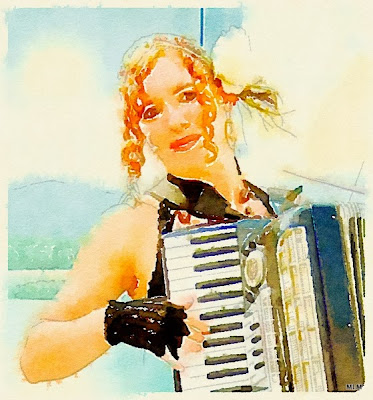
Blue Lightning Watercolor Portrait No.2 

My Friend Vicki M. at Ren Faire
If you click on it to open at a larger file, it looks more like a painting than it does at this distance.

Ever since I discovered the Waterlogue App, I've been intrigued with how it works, and deconstructing the process.  I'm still not to the point of digging out my physical watercolors and paper (don't have the workspace, or desire to clean up the mess), but I did find ...


... this Blue Lightning tutorial on YouTube that explains how to turn a portrait photo into a watercolor via PhotoShop.  So I've been playing with that this weekend.  My biggest problem is that I don't have many portraits in my files to start with--the people I know don't like to have their pictures taken.   So far, I've learned I need to work on brush strokes.  I just don't have a feel for the watercolor style yet.  That said, this is something worth practicing with ...

Then again, it is so easy, quick and satisfying to use the Waterlogue App.  The hardest thing is transferring the files between the iPad and the "big" computer.  I use DropBox, but even that takes a while for the file transfer and then simply remembering where I put things and where to find them in the transfer process.  In my experience, Waterlogue is pretty good with landscapes and still lifes, not so great with portraits, though I've had a few successes.

Here are some recent waterlogued portraits :

Waterlogued - Color Bloom Preset
This is the same image as the one up top, processed through the Waterlogue App.

The accordian player from the band, Vana Mazzi.
This is still one of my favorite Waterlogued Portraits. 

Three versions of my son, Oliver in Waterlogue :

 Waterlogue - "It's Technical" Preset 
You can even see the graph paper underneath the virtual paint.

Travelogue Preset via The Waterlogue App.

Rainy Preset via Waterlogue.


 Here's my version using the Blue Lightning Watercolor Tutorial "manually" in PhotoShop Elements.  I followed the instructions faithfully, with the final addition of a 2LO background texture, then softened it up a bit more in Picassa.     I'm getting a better idea of what to do with the brush strokes, but it still seems like there's too much detail for the watercolor style.  The final softening in Picassa helped with that.   That said, I like this version.


Tuesday, July 01, 2014

Barns of Wisconsin Series


I've worked up this particular photo in the past, fiddling with settings in Light Room, but I was never really happy with it.  I do like this version much better, though. 

Here's the recipe in PhotoShop Elements :
Layer 1 : Background Image (minus some power lines)
Layer 2 : Old Paper Action - Normal 78% opacity
Layer 3 : Old Photo Action - Normal 74%
Layer 4 : 2 Lil Owls Grandeur 1 Texture - Soft Light 100%
Layer 5 : Copy Layer 4 - Multiply 64%
Layer 6 : 2LO French Brocante 1-24 Texture - Soft Light 44%
Layer 7 : 2LO Cracked 1 Texture - Soft Light 57%

Posting to the Texture Artists FaceBook Group.

Saturday, April 05, 2014

2BD43 Faery Tale Book Marks

[Click on the image above for a clearer picture of the words.]

For this week's Beyond Beyond lesson, Kim had us working with a pdf template from Creative Label Concepts.  I had no idea you could pull in a pdf as a layer in Photoshop Elelments and work it to your heart's content.  That tip right there was worth the price of the class!  I just always thought PhotoShop dealt with image files, not pdfs.   In all, I counted 19 PSE layers to develop these 3 tags/bookmarks.  It was more like 3 assignments instead of just 1, so I spent a lot of time with it.  I'm really feeling comfortable with PSE these days --thanks to Kim's classes. 

We started with the templates, isolated them onto their own layers, then added texture, text, and other elements with brushes, etc.   Kim's lesson had us making hang tags--I suppose that's a great thing for scrapbookers and people working with mixed media.  I don't actually have the capability to print in color at home, nor am I likely to add special tags to a gift, either.  Hence, this was a theoretical exercise for me. 

In Kim's example, she used the dome top tag template above.  I kept thinking it looked like a tombstone ...   Another person in the class elongated the templates (or maybe she chose another template altogether) to make bookmarks.  I really liked that idea, so I borrowed it. ;-)

As for the quotes, I'm always looking for a way to pull in my love of fairy tales and how important they are to our every day lives and how we cope.   I have a book of essays by academic Kay Stone : Some Day Your Witch Will Come.    The sentiment is a tongue-in-cheek play on "some day your prince will come."  That title essay talks about how necessary these wicked witches are to the stories and our psyches.  Encountering  a Witch can bring it's own gifts.  In my own life, I had to come to terms with my own witch before I could meet my prince charming.  The Witches push us to do things we wouldn't otherwise do, or think we'd be capable of.  I had some self-development work to do before I could be in a good relationship.  The Witch taught me to deal with my anger, to stand up for myself, to value myself.  You don't get that kind of encouragement in a plush comfortable setting at home with a "good mother" -- That's why those good mothers always die off.  The Witches give us that nudge to do what we think is impossible, to grow in ultimately positive ways that we may not otherwise choose.    Now, looking back with hindsight, I am grateful for my encounters with real-life witches--although, I couldn't say that at the time.   

For the Spiderweb tag/bookmark, I used Kim Klassen's Chalk Magic Texture for the background,  Ruthie Font, and a spiderweb brush.  The cob webs give the idea that someone has been waiting for quite some time for her witch to come ... 

The next quote from my all-time favorite witch, Baba Yaga : Consider the uses of adversity.    I suspect the sentiments and the skull will be all too dark and Gothic for my fellow 2B classmates.  Truth be known, the flower pics and inspirational quotes are not really my style.  For this tag/bookmark, I used another texture from 2 Lil Owls, though I'm not sure what collection it's from.  I also used a couple of brushes typical of old tombstones.  These are also very important symbols for Baba Yaga.  In the Baba Yaga stories, she has a fence made of skulls-and-bones surrounding her property (Remember that house that dances around on chicken legs?  That was Baba Yaga. :-).  Once Vasalisa has accomplished the impossible tasks BY set for her, the Baba gives her the creative fire in a skull torch which lights her way home.   You see-- some people DO survive their encounters with the witches--but only if they learn the lessons they have to teach.

Of course, I couldn't leave out my beloved Rumplestilskin (from ABC's Once Upon a Time), so he gets his own bookmark/tag, too.    For this bookmark, I used Texture 13 from 2 Lil Owls Fairy Tales Collection.   Aquiline Two Font and an image of a spinning wheel charm as his memorable detail.   I am starting to think he's one of the 3 Fates in Once Upon a Time's rendition.  That puts him in a whole new light, doesn't it?


Beyond Layers

Sunday, March 16, 2014

2BD39 Logo Challenge


This week, Kim challenged us to create a logo inspired by one she had seen in real life at a local cafe.  I spent an embarrassing amount of time on this, not because I had problems with PSE, but because I've been thinking about my logo since 1994 when I started my little production company.  I knew I wanted a simple green leaf and the words -- that's what it's been all this time.  I took so long because I was making it more complicated than the lesson needed to be.  Once I settled into design and Kim's given recipe with circles (not leaf shapes), it all went well.  I followed her recipe pretty faithfully. 

My tweaks were the chosen fonts :
Pea Miss Mariss for my name
Pea Aimee for Sweet Leaf Productions

Textures :
Green Leaf Texture from Stockvault
Kim Klassen's 1402 texture for the background


A few tweaks (for another day?)
I might make that outer ring not so dark, or change the color a bit.  It's kind of heavy next to everything else.   Maybe a blend mode will take care of that?

I'm going to let this settle a while ...  Someday, maybe I'll add it to the header of my blog. ;-)

Beyond Layers

Sunday, February 16, 2014

2BD37 Gothic Valentine


For this week's lesson (from last December, actually), Kim offered a set of PhotoShop Brushes.  I'm so glad they were not strictly seasonal and that I could use them a few months later--now.

I used a free slate texture from Stockvault as the background.
Then layered up a few of Kim's new brushes, including the red hart for a spot of color.
Added the text with a favorite quote from Rumi.

Done!  Easy-peasy!

Beyond Layers

Monday, January 06, 2014

Cello by the Lake (Variations)

 
Cello by the Lake  (Version 5)
In a previous version, you couldn't really tell that it was next to a Lake because on that overcast morning, the sky melded with the water on the horizon.  In this version, I tried to make that division a little more explicit.

Here's the recipe :
Layer 1 : Background Image
Layer 2 : RadLab - Troy, Fuzzy Navel, Meadowlark
Layer 3 : Texture Kim Klassen Cool Grunge - Soft Light 100%
Layer 4 : Texture 2 Little Owls Fairy Tales 12 - Multiply 74%
Layer 5 : Texture 2 Little Owls Artisan 3(5) (on lake only) - Soft Light 63%
Layer 6 : Texture 2 Little Owls Artisan 2(5) - Soft Light 100%
Layer 7 :  Texture Kim Klassen Paper Stained Music - Soft Light 69%
Layer 8 :  Texture Sheet Music Notes - Soft Light 54% (with selective masking on and around the cello)
Layer 9 : Text - Jellyka Le Grande Saut

 Cello by the Lake (Version 3)
Here's the Recipe :
Layer 1 : Background Image
Layer 2 : RadLab to make black and white / desaturate
Layer 3 : Texture 2LO Fairy Tales 12 - Multiply 66%
Layer 4 : Texture 2LO Artisan 2(5) - Soft Light 38%
Layer 5 : Texture Coffee Shop Blog Decadence - Darken 53%
Layer 6 : Text - Jellyka Le Grand Saut Font

Final Treatment was I'm feeling lucky in Picassa before exporting it.  This brightened up the center area nicely.

In this one, I chose NOT to straighten the horizon (actually I tried, but my computer was not letting my save basic changes at this point, so I went with the flow ...).  I actually like this better is it gives the idea that the earth is round, that there's a curve to the horizon.  This way, the horizon line echoes the shoreline a little better, too.

Wednesday, October 02, 2013

My Very own Charming Textures in Action

The other day, I posted a layout with a set of 4 textures that I made myself.  ;-) 
I named the set after characters in the ABC tv series Once Upon a Time.
I wanted to test the textures layered with a photo.  I'm pretty happy with the results :

 
 This is the Charming Texture, layered with the old Red Leaf.
Recipe :  1) Background Layer - Red Leaf
2) Text - Viner Hand Font - Normal 100%
3) Charming Texture - Multiply 100%
4) Copy Layer 3 - Charming Texture - Multiply 57%
Picassa Glow

 Mary Margaret and Henry Textures layered with a feather "blank."
Recipe : 1) Background Layer - Turkey feather 
2) Mary Margaret Texture - Multiply 72%
3) Henry Texture - Soft Light 100%
4) Text - Arabella Font - Soft Light 100%
[Note : The original is a little pinker than this exported version.]

The Henry Texture behind the Red Leaf blank.
Recipe : 1) Background Layer - Red Leaf
2) Copy Layer 1 - Screen 100%
3) Copy Layer 2 - Screen 100%
4) Henry Texture - Multiply 100%
5) Copy Layer 4 - Soft Light 39%
6) Text - Viner Hand - Color Burn 66%
7) Copy Layer 6 - Soft Light
 
Here's the Emma Texture with the Red Leaf.  
 Recipe : 1) Background Layer - Emma Texture - Normal 100%
2) Red Leaf - Soft Light 100%
3) Text - Viner Hand Font - Hard Light 89%

Do you like what you see?
You can download my textures on Flickr with links below :

If you use my textures, please do me the courtesy of linking back to show me what you did with them. 

Beyond Layers

Saturday, September 14, 2013

2BD28 Texture Tweaking


For this week's lesson, Kim had us take one of her textures and tweak it in Adobe Camera Raw to come up with 3 variations.  This easier than I thought it might be--I now have to resist the temptation to fill up my hard drive with umpteen variants of textures.  It's pretty amazing that you can get so many different looks out of 1 original just by playing with the sliders in Camera Raw.  Temperature and Tone can change the color; Clarity and Vibrance can change the amount of grit / grunge ...

Once we had our texture variations, Kim had us set them in a 4-square layout.  This has been the easiest method yet -- in my eyes.  Stacking them in layers, then pulling them out and using the crop tool to extend the canvas.   I added a snowflake brush in the center to tie it all together--kind of like a seal to brand them from the same family.

Beyond Layers

Saturday, June 15, 2013

2B D12 : Night Magnolia


The 2B lesson this week was about gathering inspiration from magazine layouts.  I admit, this has been kind of a tough one for me.  This lesson came out back in April just about the time I decided to join the class.   At the time, I was already feeling overwhelmed that I was 12 lessons behind from the very start, and clueless about Light Room.  But the other thing is that I just don't really buy magazines, and I usually ignore the ads.  The magazines I have around the house tend to be quilting and surface-design inspired--typically 2-dimensional and flat.  At first I thought I could set up a still-life with one of my quilts, but I never got around to it ...     I work in a medical library, but the images and ads in those types of professional journals are not what Kim had in mind.  Most of them are delivered online now without the ads.  Hmmh ...

In passing a waiting room magazine the other day, I flipped through it and caught a fleeting glimpse of what might have been a perfume ad.   A-ha!   I can work with that!  

Here's the image I started with.  A few weeks ago, we were walking the dogs after the sun had gone down.  I had the camera along, because I wanted some shots of the magnolia trees that were blooming at the time.  At first, I thought the pics would be a loss as it seemed too dark.  When I got home and looked at them on my laptop, I was pleasantly surprised to find that I'd captured them in The Blue Hour.  The Magnolia flowers glowed like moonlight ...

Here's the processing layer-by-layer :
Layer 1 : Background image.  Spot-healing to clean up and smooth out the background.
Layer 2 : Text - Night Magnolia - Abbeyline Font
Layer 3 : Text - The new fragrance ...   - Papyrus font
Layer 4 : Text - Quiet Passion - Abbeyline Font with a swirly flourish brush by Obsidian Dawn
Layer 5 : Photo Filter - Cooling Blue

The second part of the lesson, Kim showed us how to add tints with graduated filters.  I did play around with this technique, but in the end, I decided the photo filter worked better for this particular image as I wanted an overall tint.  I'm glad to have the knowledge for using tints and graduated filters to add to my skills.

By the way, Sweet Leaf Productions is my own little production company that I started way back in 1994.  At the time, I was a dressmaker.  Being a production company, the name didn't limit my creative pursuits.  As The Sweet Leaf Notebook blog can attest, I've made lots of stuff over the years under this moniker.  It's been a fun journey!

Beyond Layers

Sunday, May 19, 2013

2B Day 8 Part 2 : Matte Finishes and PSE Layout


This part of the lesson focused on an easy way to set up a layout in PhotoShop Elements using the Photo Prints > Contact Sheet option.  So quick and easy! It puts each picture on it's own layer.   I will definitely be using this technique again the future.    Please note : The images in the above layout did not get any of the Matte Effect treatments--yet.

After the layout was created, I added a few textures and the text to tie it all together.  The subjects are a series of steam engines in Fairbanks, Alaska.    I love rust!


So here are the Matte Finish experiments with another contacts sheet layout in PSE.  So easy!  The underlying background is Kim Klassen's Naturally Texture. 

I took one of the rust and steam pics from above.  The original picture needed some deaturating to tone down that green grass.  I also wanted to bring out the rusty colors.  When I was working on the initial desaturation, the image took on a mind of it's own resulting in My Matte.   Although I didn't think I had a matte finish by the end, I liked what I saw, so I saved it.  Then I took a new copy of the desaturated image and tried Kim's Matte Effect recipe in PSE.  Same for Light Room.  I added some textures to all 3 as the sky needed some texture.  In the end, I am amazed at how similar all three of them are.

Processing Step-by-Step for "My Matte":
Layer 1) Steam Shovel Background Layer
Desaturate :
     Layer 2) Background Copy
     Layer 3) Levels Adjustment - Screen Blend 28%
     Layer 4) Gadient Map > BW > Normal  72%
     Layer 5) Color Fill (Rusty Orange) - Soft Light  70%
Layer 6) Levels Adjustment > Pull in blacks
Layer 7) Texture - 2 Lil Owls Artist Collection 1(2) - Soft Light 69%
Layer 8) Add Text - Viner Hand ITC - Layer Style Rain - Layer Style Sun-faded - Normal 90%
Layer 9) Kim Klassen's Naturally Texture - Multiply 74%


Processing Step-by-Step for Matte Effect
1) Background Copy (Desaturated)
2) Levels Adjustment : Pull darks and lights in a bit
    Enhance > Adjust Color > Color Variation : Decrease highlights and shadows in blues and greens
3) Text : Viner Hand ITC
4) Kim Klassen's Naturally Texture at Multiply 68%
5) Copy Layer 4 - Soft Light 21%
6) Kim Klassen's Pumpkin Grunge - Soft Light 26%


Prosessing Step-by-Step :
1) Background Image (desaturated)
2) In LightRoom : Tone Curve : Upped the Shadows / Downed the Lights
                              Split Toning : 30/12    45/8
3) Pulled into PSE to add texture and text

Whew!  That took way longer than I thought it would.  I learned a lot, though.  It's a lot easier to rumble around in PhotoShop Elements these days.  And Light Room is getting easier, too.   Time to do something else, though--like mow lawn.  Cheers!

Beyond Layers